Judging a book by its cover – travel by book
Book covers to transport the reader
They say you shouldn’t judge a book by its cover, but I think we all do to some degree. There’s some covers recently that I’ve been particularly impressed by. The artwork is stunning and they transport you to the setting and destination of the story within.
Island setting off the coast of IRELAND
Cover: Simple, eerie, sleek design
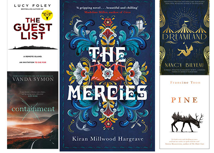
The Guest List by Lucy Foley
This cover is striking because of its simplicity. The island is clearly shown but it’s anonymous. Where is it? Who or what is on it? There’s something very interesting and stylish about silhouettes. When you read the book, that image lingers in front of your eyes. As you open the book you are transported to that island, where you meet the characters, attend a grand event, survive the crossing and witness a murder….
Vardo, Norway
Colourful illustrations, waves, dolphins and other marine imagery
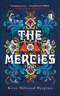
The Mercies by Kiran Millwood Hargrave
As well as being stunning, this cover is very clever. It’s the kind of Nordic design that is very popular in Scandinavian countries. Look closer and it’s a mesh of all the things which showcase the remote, island landscape in the story. The novel was inspired by the very real and tragic storm that battered and destroyed the community of Vardo, Norway in 1615. There’s illustrations of dolphins, boats, oars and of course the waves. All of this and more make up the amazing story that is The Mercies but it’s the cover that will capture your eye in the bookstore and then capture your heart and mind when you read it.
Coney Island, NY
Silouettes, circus imagery and sharp sleek shapes
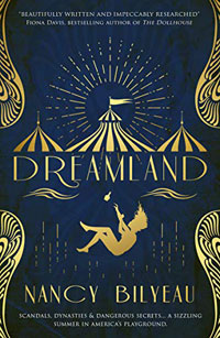
Dreamland by Nancy Bilyeau
You can imagine what this book is going to be about, but it’s so much more. Just look at the cover which takes you off to the circus, where there’s magic in the air. There’s a sense of the golden days here too and that’s because it’s set in the heyday of America’s playground – Coney Island. This was the place to be, where anyone could be anyone and where anyone was. Think The Great Gatsby with added pizzazz. I love the circus imagery, the glitz and the movement of the falling boy. People did ‘fall’ here; usually into a pit of despair or a lifetime of addiction and vices. A great eye catcher of a cover and describes the journey inside well.
Dunedin, New Zealand
Cover: Inviting, warm and that crossed out title!?
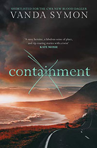
Containment by Vanda Symon
You see this cover and immediately want to go to that beach. But wait, why is the word containment crossed out and why is the beach dark and red? That’s one eye catching and interesting image. Having read the others in the series, I image I know what I’m getting, but this image looks darker yet more inviting somehow. I do love a cover with a beach, path or scenery on it and this ticks all the boxes. That road going nowhere…..well around the corner of a cliff where you can’t see where you are going…..
It draws you in!
Scottish Highlands
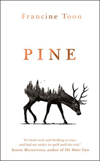
Cover: Simple, black and white, love the blurred/spiky animal shape!
Pine by Francine Toon
This is just lovely. That simple single image is so strong and vivid. It suggests the highlands, a rugged, remote setting where deer and other kinds of animals roam free. It suggests winter, naked trees, barren land and coldness. Having the image of the animal merge with the image of those trees is just genius. You know where you are going in this book and what you might see. What you can expect however remains a mystery and that is the brilliance of an image which just gives you enough to leave you wanting more.
There’s many more covers like this, but I love looking at my favourites and thinking about what made me want to read it and go on the journey the cover teases…

